Yuki
Collins

I’m a visual designer working across graphics, motion, and interaction.

My work ranges from touchscreen experiences and information design to large-scale projection and multi-screen environments. I like turning complex content into clear, engaging visual systems, whether it appears on a screen, across a wall, or somewhere in between.

All projects shown here are Unified Field projects, created for the studio’s clients by collaborative teams. My specific role and contributions are noted in each project.

Exhibition & experiential · New York · info@yukicollins.com


Unified Field forJewish Federation of San Diego · 2026

Legacy of Light

A Holocaust education exhibit that travels by trailer. My work centered on two of its digital experiences.

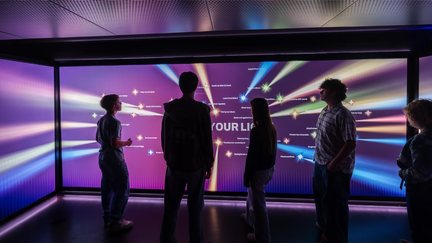
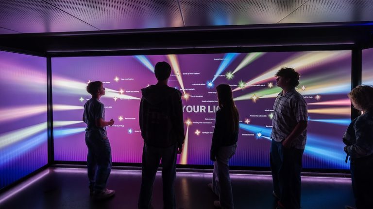
Visitors standing in the darkened room as rays of coloured light travel across the LED walls around them.

Spark Interactive is a semi-trailer that expands to 560 square feet and parks at schools across San Diego County. Middle and high school students spend about ninety minutes inside.

Interactive

Share Your Light

The room starts dark. Visitors make it brighter.

exit
The interactive begins in the main space and continues into the exit space.
The mobile exhibit parked on the San Diego waterfront, its exterior LED wall showing a Warsaw Uprising panel dated August 1, 1944.
The exterior LED, running content I designed for it.
The four pledge themes shown as four distinct colours, each throwing a ray of light across the walls.
Four pledge themes become distinct colors and rays of light.

I designed how individual choices become light and accumulate into a shared experience. At the end of the exhibit, visitors choose actions they can carry forward; each pledge becomes a ray of light across the walls, gradually transforming the space.

Film

Holocaust 101

Illustration, motion, and information design across three walls.

visitors
Holocaust 101, selected sequences, 0:30
Sepia period photographs of everyday Jewish life scattered and falling across a dark ground. Generated with AI from client-supplied scenarios, art-directed by me.
AI-generated period scenes based on client-provided scenarios, art-directed by me.
The Final Solution wall running across the three LED walls inside the darkened exhibit space.
Holocaust 101 installed across three LED walls inside the mobile exhibit.

Working from the client's script, I developed the film's visual language through illustration, collage, information design, and animation, using shifts in style and motion to make the story clear and emotionally immediate. The original 12,160 × 2,160-pixel canvas spans three LED walls, surrounding the audience.

Watch full film: · (2:42 · narration + sound)

My role
Visual + interaction designer
Holocaust 101
Illustration, motion + information design
Share Your Light
Visual + interaction design
Format
Multi-wall LED + web
Languages
EN · ES

Press: Times of San Diego · San Diego Union-Tribune

Unified Field forThe Strong National Museum of Play · 2023

Digital Worlds: Level Up

Four of the exhibit’s games, each teaching its own rules to whoever walks up.

Pixel Portrait: a visitor's portrait rendered in the visual language of early game graphics.
Four visual styles trace the evolution of game graphics.

A 10,000-square-foot exhibit about how video games work. I designed four of its activities, each with its own visual world, interface, and motion: a steampunk lever puzzle, a screen that physically tilts to slide blocks, a portrait machine that redraws visitors in different eras of game graphics, and Conway’s Game of Life seeded by hand.

Each one has to teach its own controls before anyone can play. That is what the graphics are doing.

My role
Interaction + visual designer
Games
4 of the exhibition’s activities
Interaction
Game flow + interface
Visual design
Graphics + motion
Controls
Levers · tilting screen · camera · touch

Unified Field forMuseum of Tolerance, Los Angeles · 2022

Wannsee Conference

Fifteen screens with no front row. The visitor stands inside the composition.

15 monitors
Selected sequences from the fifteen portrait films.
The Wannsee Conference installation standing in the Museum of Tolerance atrium.
The installation within the Museum of Tolerance atrium.
Inside the installation: fifteen displays surrounding visitors in the semi-enclosed space.
Fifteen displays surround visitors inside the semi-enclosed space.

Working with the team's concept and historical content, I developed the visual treatment across fifteen screens, layering portraits, archival imagery, documents, typography, and data into a continuous motion environment.

The exhibition presents the fifteen participants not as abstract villains, but as people with professions, families, and ordinary lives. Their personal histories sit alongside evidence of their roles in the Holocaust, exploring how people within familiar institutions and social structures can participate in extraordinary harm.

My role
Visual + motion designer
Visual design
Portraits + archival collage
Motion
Fifteen portrait films
Experience
Immersive installation
Format
15 displays + projection

Unified Field forThe Maritime Aquarium at Norwalk · 2024

Life Among the
Grasses

Wildlife illustration and interface design for the salt-marsh touchscreens.

kiosk
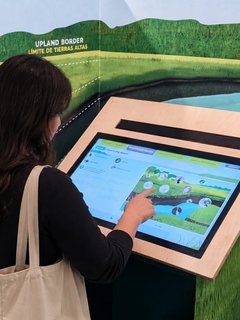
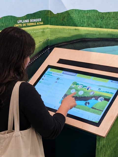
A visitor touching the wood-framed, tilted touchscreen kiosk installed in front of the illustrated salt-marsh wall, whose species are labelled in English and Spanish.
The Indigenous Peoples topic screen: an illustrated marsh with a great blue heron, circular photo buttons for each sub-topic, and an English/Español toggle.
The kiosks extend the exhibition’s existing visual language into an interactive experience.
The hay-cutting mini-game: two figures scything salt hay in the marsh grass, with SCYTHE and STEP controls and a Perfect Cut! result.
Mini-games turn exhibit topics into simple interactions, including this hay-cutting activity.
Nine salt-marsh species illustrated for the interface: fiddler crab, great blue heron, diamondback terrapin, horseshoe crab, osprey, white-tailed deer, clam, seaside sparrow and muskrat.

The interactive follows the Long Island Sound marshes from prehistory to today. I designed the touchscreen experience and illustrated the wildlife throughout the interface. Working within the exhibition’s established visual language, I developed the kiosks to feel consistent with the surrounding graphics and environment.

The content was organized into four parallel storylines rather than one line: ecology and geology, Indigenous peoples, uses and perceptions, crossroads. My work was the visual system that carries them, and the small activities that break up the reading.

Scientific accuracy shaped the illustration style. I worked closely with the curator to get each species and its identifying features right, while keeping the illustrations warm, clear, and visually consistent across the experience.

My role
UI + visual designer
Kiosks
UI/UX design
Interaction
Mini-games
Illustration
Wildlife + habitat
Format
Touchscreen kiosks
Languages
EN · ES

Unified Field forMuseum of Tolerance, Los Angeles · 2021

Social Lab

Dense, difficult data made readable at a glance, from several angles at once.

tabletop
Large-scale imagery displayed across the curved mesh surfaces.
Infographics designed to communicate quickly from multiple viewing angles.
Newspaper graphics and card icons created for the interactive kiosks.

I joined the project during production, working within the established design direction. My work was the graphics and infographics for the interactive kiosks, and the imagery for the large-scale mesh displays.

The infographics had to carry dense, difficult content to several people reading the same surface at once, from different sides. Nothing could have a single right way up.

My role
Visual designer
Infographics
Data visualization
Kiosk graphics
Graphics + icons
Environment
Mesh projection imagery
Format
Touchscreens + projection

Award: SEGD Honor Award 2022

Unified Field forNew-York Historical Society · 2021

Women in Journalism

Visitors read this standing in the gallery, on their own phones.

phone
A hand holding a phone showing the home screen: a collage of nine journalists' portraits under the title Making Headlines, with Stories, People and Themes buttons.
Collage of archival material: newspaper headlines including "I Was a Part of the Bronx Slave Market" and "Must They Die?", portraits of the journalists, a Torchy Brown comic strip, protest photographs and a typewriter carriage, layered with halftone screens and cut paper shapes in red and kraft.
Halftone, cut paper and collage. Journalism used to be paper.
The Charlotta Bass profile on desktop: her portrait rescreened as halftone above a pull quote, then her biography set in two columns with archival photo credits.
On desktop, the profile widens into two columns.

Created with a teen class at the New-York Historical Society as a companion to the exhibition. Because visitors would use it on their own phones in the gallery, the experience was designed mobile-first.

Teen participants researched the nine journalists and provided the content and source materials. Based on their research into museum interactives, the site was organized around three entry points instead of a single linear path: stories, people, and themes. I designed the interface, typography, navigation, and archival collage system, then adapted the experience across larger screens.

My role
Visual + UI designer
UX/UI design
Mobile-first interface
Visual design
Collage + type system
Content
Created with teen participants
Format
Responsive web